I recently had a client who had collections nested deep via limiting collections and various include/exclude relationships. This is absolutely fine… organize your collection structure how you see fit; I wouldn’t say there is a right way to do it. There is however a concern when you start to nest collections too deep and it becomes hard to figure out how the chain of updating works. Depending on how you organize the collections in ConfigMgr can make finding the limiting collections a bit difficult when you just want to check details like membership rules and update schedule.

The Code
With this in mind I set to writing a “small” application which can show you your collection relationships in a tree view. In addition to this, it will expose the refresh schedule, rules, and number of members. All of this should help give you a good view of your collections in ConfigMgr. The code is not very pretty but you can get it from HERE.
The App
If you like to skip the details and just get the app… well, here you are. Please be aware that large environments with lots of collections can take a long time to populate. In my testing in an environment with 750+ collections it took around 30 seconds for the tree view to show up.
First, the thing my lawyer makes me say with any application I create: THE SOFTWARE IS PROVIDED “AS IS”, WITHOUT WARRANTY OF ANY KIND, EXPRESS OR IMPLIED, INCLUDING BUT NOT LIMITED TO THE WARRANTIES OF MERCHANTABILITY, FITNESS FOR A PARTICULAR PURPOSE AND NONINFRINGEMENT. IN NO EVENT SHALL THE AUTHORS OR COPYRIGHT HOLDERS BE LIABLE FOR ANY CLAIM, DAMAGES OR OTHER LIABILITY, WHETHER IN AN ACTION OF CONTRACT, TORT OR OTHERWISE, ARISING FROM, OUT OF OR IN CONNECTION WITH THE SOFTWARE OR THE USE OR OTHER DEALINGS IN THE SOFTWARE.
Download the Collection Relationship Viewer
The Details
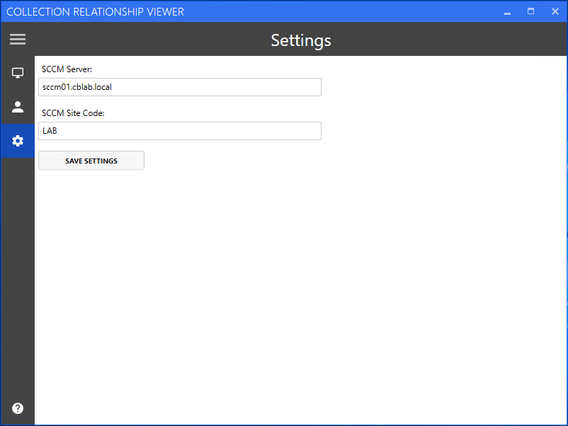
There really isn’t much to say here. The application itself is pretty straightforward. In the settings you set the server and site code of the primary site that you want to search against. I haven’t tested this with a central site, nor do I have any plans to.

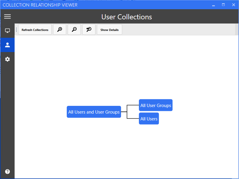
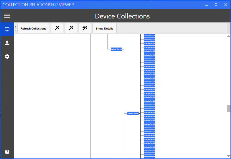
When you’re ready to search choose either the devices or user icon and then press “Refresh Collections”. A loading dialog may display (depending on how many collections you’ve got) and eventually you’ll see the tree view.

For particularly large environments, the tree can be zoomed in and out although it doesn’t change the fact that the layout can look a bit daunting. Unfortunately there isn’t a really good way to do this in a tree view. Maybe I can consider a different view type in the future.

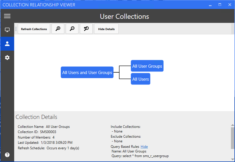
By clicking on a device or user collection in the view, the details pane will be displayed with a bunch of pertinent details about the collection including but not limited to Collection ID, membership rules, and last refresh date.

Unfortunately due to some limitations in the package I’m using to write the tree view and my limited coding experience coupled with a lack of time to dig any deeper - clicking on a collection doesn’t highlight it or change it’s color. Someday that might be nice - but honestly probably isn’t fully necessary.
Final Thoughts
Anyways - I hope you enjoy it. If you have any questions or run into any bugs please let me know in the comments below or via email.
That should do it for now! As always, happy admining!


Share this post
Twitter
Facebook
Reddit
LinkedIn
Email